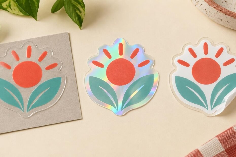
White ink is less about adding one more color and more about controlling the material underneath your design. On clear stickers, it can reduce how much the application surface shows through printed artwork. On holographic stickers, it can reduce the rainbow material’s influence in selected areas. Leave the white layer out, and the clear or reflective base becomes an active part of the image.
That makes the central design decision straightforward: choose where you want the material effect and where you want more visually solid artwork. Then confirm that the sticker product and production workflow can create that result before you build the entire design around it.
What a white underprint does
Many printing processes build color with cyan, magenta, yellow and black inks. Those inks can interact with the material beneath them, especially when the substrate is transparent, metallic or reflective. A white underprint is a white layer printed beneath some or all of the colored artwork. It gives the color a lighter, more neutral foundation.
The Epson SurePress white-ink guide describes white ink as a layer commonly printed before color on clear, metallic and similar label materials. It may act as a base beneath colored artwork or appear as a visible white part of the design.
Think of it as a controlled backing rather than a magic opacity switch. A white base can make an area appear more opaque, but the exact result depends on the printing setup, ink behavior and material. There is no responsible universal percentage that describes how opaque every white-backed area will be.
Clear material makes the application surface part of the design
A clear sticker does not exist visually on its own. The bottle, window, laptop or package beneath it contributes color and contrast. StickerMart’s clear stickers are intended to provide a transparent-background look, and unprinted areas allow the application surface to remain visible.
Suppose your logo contains navy lettering, a pale yellow icon and an open transparent border. On a white box, the logo may look close to the version shown on your screen because the box supplies a light background. Put the same clear sticker on a dark green bottle, and the result changes. The navy may lose contrast, while the pale yellow may become less noticeable.
A white base beneath the navy and yellow areas can reduce that interaction and help those printed elements read as more visually solid. The transparent border can remain unprinted so the bottle still shows through. This creates a deliberate combination of opaque-looking artwork and clear negative space instead of asking every part of the logo to behave the same way.
Light artwork deserves particular attention. StickerMart notes that light-colored designs on clear material may be less noticeable against some backgrounds. If your design needs opaque white areas or a particular appearance on a dark surface, contact us before ordering so we can review the available printing options for the product.
Holographic material adds light and movement
Holographic stickers present a different version of the same decision. The base material reflects a color-shifting rainbow effect that changes with the light and viewing angle. That effect can influence printed colors and compete with fine details.
Return to the simple navy-and-yellow logo. If the whole design prints without a white base, the holographic effect may remain visible through or around the colored areas, depending on the production treatment. That can be exciting when the goal is a metallic, shifting logo. It can also pull attention away from small lettering or make familiar brand colors feel less stable.
A selective white base, when supported by the chosen product and workflow, can separate those jobs. The navy lettering might receive white beneath it for stronger visual separation, while a star or border remains open to the holographic material. The design then uses the rainbow effect as an intentional accent rather than an uncontrolled background.
White can also be part of the visible artwork. For example, a white wordmark might sit inside a holographic ring. In production terms, however, visible white and white printed beneath another color are different roles. Your proof and production instructions need to make the intended result clear.
Three ways to treat one simple logo
| Treatment | Expected visual role | Useful when |
|---|---|---|
| No white base beneath the colors | The clear application surface or holographic material contributes strongly to the printed appearance | You want transparency, reflection or shifting color to remain part of the artwork |
| White beneath the full colored logo | The colored artwork gains a lighter foundation and appears more visually separate from the base material | Color recognition and legibility matter more than showing the material through the logo |
| White beneath selected areas | Some elements appear more solid while other areas reveal the clear or holographic base | You want controlled material effects around icons, borders or decorative accents |
This is a planning model, not a promise that every treatment is available on every StickerMart product. The design only works as intended when the selected product supports the required white treatment and the production team can identify the intended areas.
For a character illustration, the same logic might mean keeping the face and small expression details visually solid while allowing a jacket, magical effect or outer border to show holographic movement. Our guide to choosing holographic or standard vinyl for character stickers explores how the material can compete with delicate linework and low-contrast details.
Start with the intended surface and viewing conditions
Before deciding where white belongs, identify where the sticker will be used. “Clear sticker” describes the material, but not the final background. A transparent package containing a dark product creates a different result from a clear window, a white mailer or a silver bottle.
Ask four practical questions:
- Will the sticker usually sit on a light, dark, transparent, colored or reflective surface?
- Which elements must remain easy to read from a normal viewing distance?
- Which areas should reveal the surface or holographic effect?
- Would a change in the apparent color weaken recognition of the logo, warning or product information?
If the application surface varies, design for the least forgiving likely background. A mark that works only on white may disappoint when it reaches a tinted bottle or dark package. Alternatively, accept the changing background as part of the concept and simplify the artwork so the variation looks intentional.
Use contrast before asking white ink to solve everything
A white base can support contrast, but it cannot rescue every design. Tiny lettering, delicate lines and two colors with similar visual weight may remain difficult to read. Holographic movement can make subtle details even busier.
Give the important parts of the artwork enough room. Enlarge critical lettering, simplify narrow gaps and avoid placing essential details where the strongest material effect could overwhelm them. StickerMart specifically recommends considering contrast, lettering size and important-detail placement when preparing holographic artwork.
You should also decide whether the effect is structural or decorative. A product name is structural: it needs to remain readable. A sparkle, border or background burst is decorative: it can usually tolerate more variation. Protect the structural elements first, then use transparency or holographic shine where movement adds something useful.
Prepare artwork around intent, not a guessed production recipe
Do not invent a white-ink channel, layer name or spot-color formula unless the printer has supplied current instructions for that product. Production systems differ. A file that is technically elaborate but based on the wrong setup can create more confusion than a clean file accompanied by a plain explanation.
StickerMart accepts AI, EPS, SVG, PDF, PNG and JPG artwork. Vector files are recommended when you want details to remain sharp at different sizes. Raster artwork should be at least 300 DPI at its intended print size.
When submitting your design, make the visual intention easy to understand. You might describe it as: “Keep the navy wordmark and yellow icon visually solid; let the holographic material show through the outer ring.” That communicates the desired result without pretending to know the exact prepress method.
If useful, include a separate reference image that labels three categories: areas intended to look more opaque, areas intended to remain material-visible and areas intended to print as visible white. Keep that reference distinct from the final artwork so it cannot be mistaken for something that should print.
StickerMart may resize, position, prepare or make technical adjustments to submitted artwork. Where proofing applies, the resulting design can be reviewed before production. The production team’s preparation and your design intent need to meet in the proof.
Read the proof for structure as well as spelling
A proof is your chance to check more than whether the logo is centered. StickerMart provides a free online proof and asks customers to review artwork, spelling, dimensions, orientation, cut shape, border placement, layout and positioning before approval. Production begins after the proof is approved.
For clear or holographic work, add these questions to your review:
- Does the proof clearly distinguish printed artwork from transparent or holographic areas?
- Are the elements that need visual solidity treated as intended?
- Are any visible white design elements represented correctly?
- Will small lettering and fine details remain prominent enough against the material effect?
- Does the cut line leave the intended border and negative space around the logo?
- Is any part of the intended treatment ambiguous enough that you should ask before approving?
A screen proof explains layout and production intent, but it cannot perfectly reproduce transparent film, reflections or changing holographic light. StickerMart notes that screen colors do not always match physical print precisely and that clear and holographic materials can affect the in-person appearance. Treat the proof as a decision checkpoint, not as a literal simulation of every viewing angle.
What StickerMart currently confirms
StickerMart currently offers active configuration options for clear stickers, including finish, shape, size, quantity and artwork submission. The clear-sticker guidance also explains that the surface beneath the material contributes to the finished appearance.
Our holographic stickers use a reflective, color-shifting material, and the product guidance warns that this background can influence printed colors and fine details. What these descriptions do not establish is that every order automatically includes a full or selective white underprint.
For related custom-printing needs beyond this project, CustomStickers custom stickers, labels, vinyl materials, and artwork preparation provides another relevant destination. For this order, however, the next step is to choose the appropriate StickerMart clear or holographic product and confirm any required white treatment with our team.
Make the material effect a deliberate choice
The most successful clear and holographic designs assign every area a job. Some elements carry information. Some preserve recognizable color. Some reveal the surface or catch shifting light. White ink can help separate those roles, but only when the design intention and supported production method agree.
Begin with the real application surface, protect the logo elements that must stay readable, and decide where the material deserves to be seen. Submit clean artwork with a plain-language description of the result, confirm that the selected product supports it and inspect the proof carefully. That turns white ink from a mysterious technical extra into a practical design decision.
Frequently Asked Questions
Does a white underprint make sticker artwork completely opaque?
It can make printed areas appear more opaque by giving the colors a lighter foundation, but the result varies with the printing setup, ink behavior and material. A universal opacity guarantee would not be reliable.
What happens if I leave out the white layer on a clear sticker?
The application surface remains part of the design. Unprinted areas stay transparent, while printed colors may look different depending on the color and contrast of the surface beneath the sticker.
Can the holographic effect show in only part of a design?
That may be possible when the selected product and workflow support a selective white treatment. Plan which elements should look visually solid and which should reveal the rainbow material, then confirm the treatment with StickerMart before ordering.
Should I create my own white-ink spot channel?
Only if current instructions for the specific product tell you to do so. Otherwise, submit clean artwork and describe the intended result in plain language, such as which areas should look solid, remain holographic or appear as visible white.
Will the online proof show the finished material effect exactly?
No. Use the proof to check artwork, dimensions, cut shape, borders, positioning and the intended treatment. Screen colors cannot perfectly reproduce transparent film, reflections or changing holographic light.