The choice between holographic vs vinyl character stickers is really a choice about art direction. Standard vinyl is usually the safer starting point when your character’s fixed palette, facial expression and small details must remain visually consistent. Choose holographic when shifting light has a specific job in the concept—creating magic, motion, atmosphere or emphasis—rather than simply making the entire sticker shinier.
Neither treatment is automatically better. A detailed character can become harder to read if the reflective effect competes with every line and color. A simple silhouette, meanwhile, may become more expressive when it anchors a changing holographic field. The right decision starts with how buyers should recognize the character before they tilt the sticker toward the light.
The quick decision: preserve the art or involve the light
| Choose this direction | When it fits | Main design priority |
|---|---|---|
| Standard vinyl | The established palette, expression or fine illustration should lead | Stable color relationships and clear details |
| Holographic | Changing light is part of the character’s story or setting | Intentional reflective areas and strong visual hierarchy |
| Prepare both versions | You are unsure whether the effect supports or distracts from the art | Compare proofs using the same size and composition |
StickerMart lists Custom Vinyl Stickers and Holographic Stickers among its product families, so begin by deciding which visual role you need before reviewing the available production choices on the StickerMart homepage. Do not base the decision on the word “premium” or assume the holographic treatment is an automatic upgrade. For some illustrations, visual restraint produces the stronger piece of merchandise.
Holographic and vinyl are not always opposite categories
Product terminology can be confusing. “Vinyl” may describe a broad class of printable sticker media, while “holographic” may describe the visible effect of a particular film or construction. Siser, for example, includes holographic PET in a printable sticker-media range alongside other films. That does not define StickerMart’s products, but it demonstrates why artists should compare the seller’s exact materials instead of treating the two words as universal technical opposites.
Ask what the finished surface looks like, where the holographic effect will remain visible and whether printed areas use an opaque base. Those details matter more than the category name. Terminology also varies across broader custom sticker options, so confirm the construction attached to the specific product you intend to order.
What changes when light becomes part of the illustration
Standard vinyl generally lets the printed composition do most of the work. The viewer reads the silhouette, face, palette and props without needing to move the sticker. Holographic material adds a second viewing state: one appearance when the sticker lies relatively flat and another as its angle to the light changes.
That second state can be delightful, but it also adds competition. Bright reflections may pull attention from delicate eyes, thin linework or subtle shading. Dark, bold shapes can hold their position more successfully against a changing field, while pale or low-contrast details may need closer review on the proof.
Think about five variables before choosing:
- Silhouette: Can someone identify the character from its outer shape?
- Expression: Do the eyes and mouth remain the immediate focal point?
- Value contrast: Are the important light and dark areas distinct without relying on hue alone?
- Effect purpose: Does the holographic field represent something specific, such as magic, sparks, water or space?
- Viewing conditions: Does the design still communicate when it is seen quickly and under ordinary indoor light?
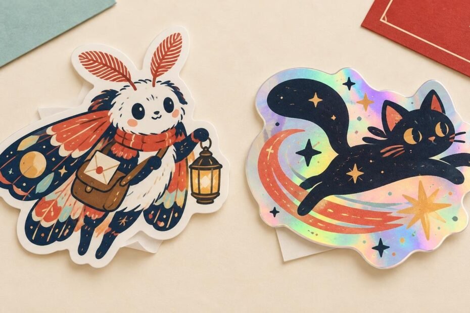
Dense illustration example: the Lantern Moth Courier
Imagine an original character called the Lantern Moth Courier. The design has a small face, layered wings, a satchel full of letters, a glowing lantern and several tiny enamel pins. Its appeal comes from accumulated detail and a carefully controlled palette.
A standard-vinyl presentation would keep those relationships straightforward: warm lantern, cool wings, dark outline and readable pin shapes. This is the sensible baseline if the facial expression and accessories are what make the character recognizable.
A holographic version can still work, but the effect needs a defined role. It might represent the glow around the lantern, appear in open spaces between wing markings or form a narrow atmospheric border. If the effect instead dominates the face, satchel, wings and background equally, the viewer has no stable place to look first.
For dense art, separate essential information from decorative information. The face, outer contour and key prop are usually essential. Sparkles, magical haze and background accents are more flexible. Build the effect around that hierarchy rather than spreading it evenly across the design.
Simple silhouette example: the Night-Cat Comet
Now imagine the Night-Cat Comet: a dark cat silhouette riding a broad comet trail, with two bright eyes and a few large stars. It has fewer internal lines and a much bolder shape.
This design gives holographic light more room to work. The dark cat can act as a visual anchor while the comet trail or surrounding space changes as the sticker moves. The effect reinforces the concept because a comet already suggests light and motion.
Standard vinyl remains a valid choice if the artist wants a specific gradient or tightly controlled brand palette. The difference is not that the simple design requires holographic material. It is that the composition can accommodate a large changing field without sacrificing the character’s identity.
Plan which areas should stay visually stable
Some printing workflows use white ink beneath color to reduce the influence of a colored or reflective substrate. Roland DG’s explanation of white base printing also shows the general principle behind selectively exposing a substrate: areas with a white base can behave differently from areas where that base is removed.
This is useful technical context, not confirmation of a StickerMart production option. Before designing separate effect zones, ask whether the selected holographic product supports an opaque base, selective exposed areas or another defined method. If it does not, adapt the illustration to the product rather than assuming the printer can reproduce a specialized layer setup.
When selective treatment is supported, good candidates for visually stable areas often include the face, tiny lettering, thin contours and objects needed to understand the pose. Exposed effect areas can suit magic, stars, armor highlights, wings, water, smoke or borders. The concept should explain the sparkle.
Review the sticker in two viewing states
A character sticker should pass a flat-view test before it passes a sparkle test. First, look at the design without imagining reflective movement. Can you identify the silhouette, expression and main color grouping immediately? If not, changing light is unlikely to repair the underlying hierarchy.
Next, imagine or review the tilted view. Ask what becomes brighter and whether that shift supports the intended focal point. If the effect repeatedly pulls attention away from the face, reduce the competing area, strengthen the character’s outline or choose the standard treatment.
Also judge the art at its intended physical size. Zoomed-in artwork can make eyelashes, symbols and prop details feel more prominent than they will on the finished piece. Use a print-size preview and check that the character still reads at a glance.
What to confirm before ordering
Prepare your artwork and questions together. A proof can help you catch shape, placement and production issues, but it is most useful when you have already defined the visual goal.
- Choose the intended size and inspect the character at that scale.
- Identify the face, contour, text and props that must remain readable.
- Mark the areas where a holographic effect would serve the story.
- Confirm the exact material and how printed color interacts with its surface.
- Ask whether selective effect areas or an opaque base are supported.
- Compare the standard and holographic prices, quantities and schedules for the same order configuration.
- Review the proof carefully before approving production.
Do not assume that an artwork layer named “holographic” will communicate the required production setup. Supply clear notes and follow the file instructions attached to the actual product. If the effect handling remains uncertain, request clarification before approving the proof.
Choose the version that makes the character easier to love
Choose standard vinyl when the character’s established colors, expression and dense details are the merchandise. Choose holographic when reflected light contributes meaningfully to the character’s world and the composition has enough visual structure to control it.
For the final decision, create one small-size preview with no simulated shine and one mockup showing the intended effect zones. If both versions communicate equally well, the character concept can break the tie: a quiet café mascot may benefit from color consistency, while a cosmic creature or magical familiar may earn the shifting light. Then confirm the available production method and review the proof before the order moves forward.