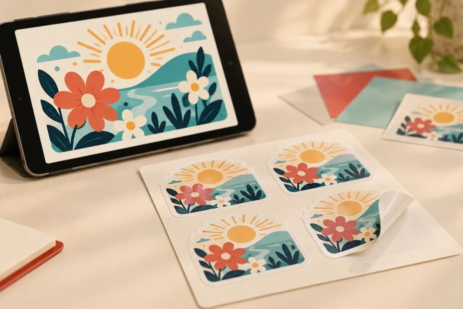
Printed sticker colors can differ from your screen even when the artwork file is correct. A display creates color with light, while a sticker reflects light from ink and a physical material. The display, printable color range, sticker substrate, finish and viewing conditions all influence the result.
The practical goal is not to make every screen predict the sticker perfectly. It is to identify colors that may change, choose a material that supports the intended look and review your proof carefully before production.
Your screen and your sticker create color differently
Phones, tablets and monitors build color from emitted red, green and blue light. Printed products use inks on a surface that reflects ambient light. As Adobe’s explanation of color modes shows, RGB displays and commercial printing systems work within different color spaces and gamuts—the ranges of color they can produce. A brilliant screen color may therefore sit outside the printable range. A monitor can also miss colors that a particular printing system can produce.
The viewing environment changes the comparison too. A sticker under warm indoor lighting may look different beside the same sticker in daylight. Screen brightness can make a design appear more luminous, while reflections and surrounding colors affect how both screen and print are perceived.
Two screens may not agree with each other. Display type, brightness, settings, age and calibration can all change the appearance. The International Color Consortium’s RGB workflow guidance explains how ICC profiles characterize device behavior and help translate color between devices, but profiles cannot make every display physically identical.
Some colors are more likely to shift
Very vivid greens, blues and oranges deserve extra attention. A bright green that seems almost illuminated on a phone may become less saturated in print because it falls outside the selected printing condition’s gamut. This does not mean every green will shift by the same amount. The result depends on the source color, output profile, press condition and material.
Subtle dark colors create a different challenge. Two near-black shades may look distinct on a bright display but merge when printed, especially when the differences rely on very small changes in tone. Fine shadow detail can also become less obvious. Very pale tones may lose separation at the other end of the scale. Adobe notes that output limitations can reduce detail in very light and very dark areas.
Give important elements enough contrast to survive that change. If a dark navy logo sits on a nearly black background, increasing the tonal difference is usually more dependable than trusting a tiny on-screen distinction. The same idea applies to pale text over a light background.
Material changes the color you see
The artwork is only one part of a sticker’s appearance. The substrate beneath the ink and the finish above it affect brightness, contrast, reflections and opacity.
| Sticker type | What affects the appearance | Best planning approach |
|---|---|---|
| White vinyl | A white base provides a stable background. Gloss can look more reflective and vivid, while matte has lower sheen. | Choose this when consistent palette and detail matter more than a changing material effect. |
| Clear | Unprinted areas reveal the application surface, which can alter contrast and visibility. | Plan around the actual surface and strengthen contrast in critical text or artwork. |
| Holographic | The reflective substrate shifts with lighting and viewing angle and can influence printed color and fine detail. | Treat the changing light as part of the design rather than expecting a fixed screen-like appearance. |
Our vinyl stickers are printed on white vinyl. The product page describes gloss as reflective and potentially more vibrant-looking, while matte has a lower-sheen appearance. Available material and finish combinations vary by product, so check the configuration for the sticker you are ordering rather than assuming every finish applies to every format.
With clear stickers, the application surface becomes part of the visual result because unprinted areas allow it to show through. Light artwork may be less noticeable on some backgrounds, while stronger contrast can help important elements remain visible. If you need a specific appearance on a dark surface or opaque white areas, contact us about the available printing options before ordering.
Holographic material is intentionally less predictable from one viewing angle to another. It creates a reflective, rainbow-like shift as the light and angle change, and that substrate can influence printed colors and fine details. If maintaining a stable brand palette is the top priority, standard vinyl may be the better fit. If movement and shimmer are part of the concept, see our guide to choosing holographic or standard vinyl for character stickers.
Do not rely on one universal RGB-to-CMYK formula
It is tempting to search for a single percentage adjustment or conversion setting that will make a screen match every printed sticker. That rule does not exist. The suitable workflow depends on the production process and its output profile.
According to Adobe’s commercial printing workflow guidance, one printer may request RGB artwork with an embedded profile, while another may request CMYK or a particular PDF workflow. Converting blindly can discard color information or create a file that does not match the actual production condition.
StickerMart’s reviewed production guidance does not specify a universally required RGB or CMYK delivery mode, ICC profile or CMYK conversion target. Our current upload guidance accepts AI, EPS, SVG, PDF, PNG and JPG files and recommends vector artwork or raster artwork at a minimum of 300 DPI at its intended size. Resolution helps preserve edges and detail, but it does not expand the printable color gamut.
If your project moves between print providers, do not assume that one provider’s file instructions apply to another. For example, customstickers.com offers custom stickers, labels, materials and related artwork preparation, but the requirements for a StickerMart order should come from StickerMart’s current guidance.
Use soft proofing as a warning tool, not a promise
Design software can simulate a selected output profile and flag colors that fall outside its gamut. This process, commonly called soft proofing, can help you notice an electric green that is likely to lose intensity or dark shades that may become difficult to distinguish.
The simulation is only as relevant as the profile selected. It is also limited by the monitor, its calibration and the room lighting. Adobe’s gamut-warning guidance can help identify problem areas, but a soft proof should be treated as a planning tool rather than an exact preview of every sticker material and finish.
What to check before approving your sticker proof
StickerMart includes an online proof for custom sticker orders, and production begins after approval. The proof is a digital preview rather than a physical color proof. Use it to check the decisions it can show clearly: artwork, spelling, dimensions, orientation, cut shape, border placement, layout and positioning.
- View the proof on more than one screen if color is important. Large differences between devices are a useful warning that the display cannot serve as a single fixed reference.
- Reduce screen brightness to a comfortable, realistic level. A screen at maximum brightness can make colors appear more luminous than reflected print.
- Check vivid greens, blues and oranges for possible loss of saturation. Decide whether the exact intensity is essential or whether a nearby printable appearance will still work.
- Zoom in on dark and pale areas. Make sure text, outlines and small details have enough contrast without depending on barely visible tonal differences.
- Consider the final surface. Clear stickers placed on colored glass, dark packaging or metal can look different from the same design over a white artboard.
- Choose the material intentionally. White vinyl supports a steadier base, while holographic material and clear areas make the environment part of the design.
- Review cut lines, borders, dimensions and orientation separately from color. A careful color review should not distract from other production details.
Set expectations around the finished material
A screen is a useful design tool, not a physical sample of ink, vinyl and finish. Minor screen-to-print color differences are a normal part of moving between those systems and generally are not treated as defects under StickerMart’s returns policy. Verified errors in printing, cutting, finishing, packing or fulfillment are addressed separately by our quality guarantee.
For the most dependable result, start with adequate contrast, be cautious with extremely vivid and near-black colors, and choose the substrate for the appearance you want. Then review the online proof for artwork and production details. That approach will not make light and ink identical, but it will give your sticker design a much better chance of working where it matters: on the finished surface.
References
- Color models and color spaces: RGB, CMYK, HSB, Lab
- White Paper 23
- Commercial printing workflows in Photoshop | Photoshop
- Vinyl Stickers – Sticker Mart
- Custom Stickers, Labels & Transfers | StickerMart
- Clear Stickers – Sticker Mart
- Holographic Stickers – Sticker Mart
- Proofs & Artwork Approval – Sticker Mart
- Identify and correct out-of-gamut colors in Photoshop on desktop
- Returns & Refunds – Sticker Mart